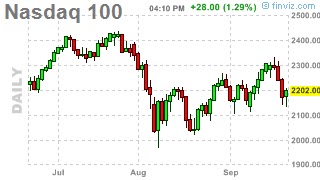
Note below, the chart on the Dow seems to be drifting lower, while the chart on the Nasdaq 100 seems to be drifting higher (note the higher highs and higher lows). The S&P 500, meanwhile looks like a great one for "ChannelingStocks.com"
Tells you where the money is going and where money is coming out of.
On the scary side, the charts on the Dow and S&P have a "Head and Shoulder" pattern forming. A break below the "neckline" would be very negative. We are just below the neckline for the Dow (right around 10700) and just above the S&P's neckline in the 1110-1100 area. This will be an important week as we try to stay above those levels.


No comments:
Post a Comment